Introduction
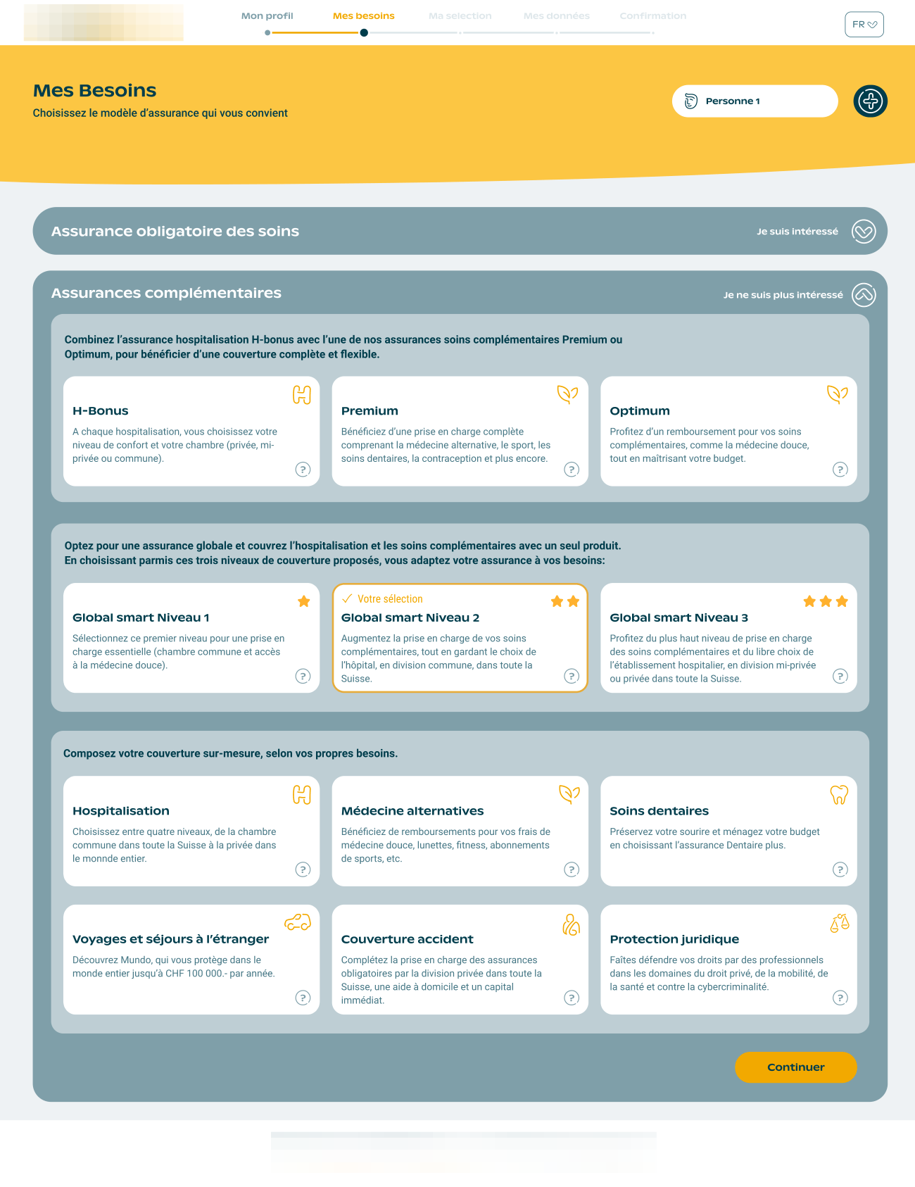
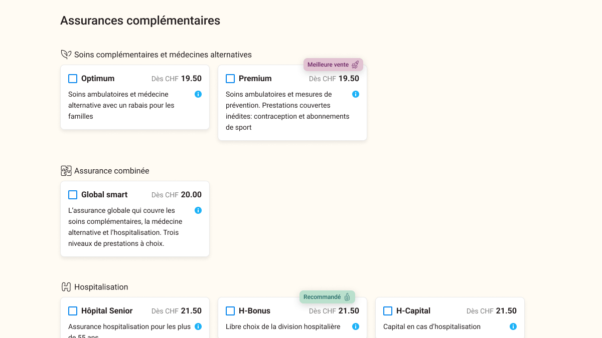
In a fast-evolving digital landscape, user-centric design is crucial for optimizing complex decision-making processes. This case study focuses on my work with a health insurance platform, where I led the design and testing of a prototype aimed at improving the user’s product selection experience. By introducing visual cues such as “Best Seller” and “Recommended” badges, we sought to increase engagement and streamline the decision-making process. Here, I’ll share key insights and outcomes from this project.
Problem Statement
Users were finding it difficult to make quick and confident product selections on the online subscription platform, which offers a wide range of health insurance plans.
Our initial analysis identified three main issues:
- Cluttered Information Architecture: Users felt overwhelmed by long descriptions and unclear categorizations.
- Low Engagement with Product Options: Many users abandoned the selection process due to uncertainty about the products and their relevance.
- Delayed Pricing Information: Price visibility came too late in the user journey, leading to frustration and drop-offs.

Objectives and Hypothesis
We hypothesized that improving the visibility of key information early in the user journey, coupled with visual badges highlighting popular or recommended options, would:
- Increase user confidence in product selection.
- Improve overall engagement by making the decision process clearer and simpler.
- Reduce user drop-off by providing immediate pricing and product recommendations.
Methodology
To validate our hypothesis, we ran a two-week unmoderated user test with 186 participants. The users were asked to complete three scenarios designed to mimic real-world insurance selection processes, using two versions of the prototype:
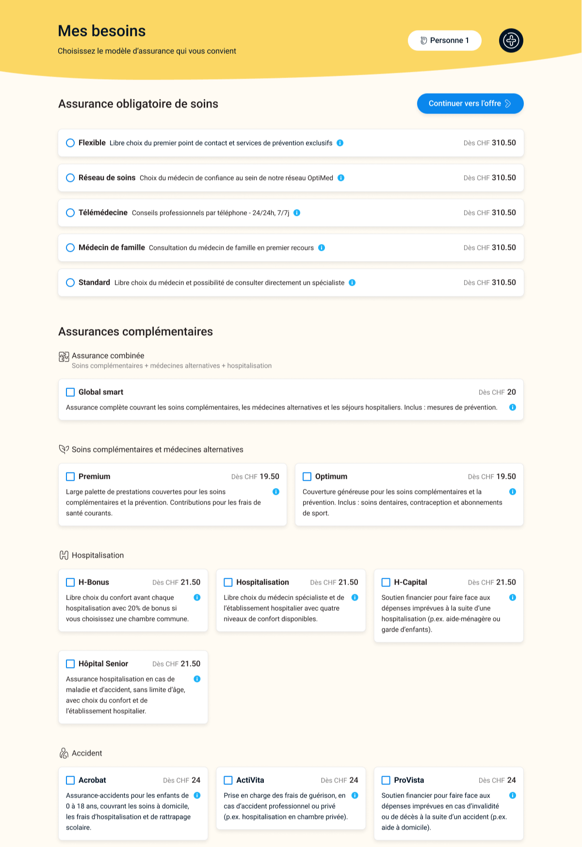
- Version A: Without badges.
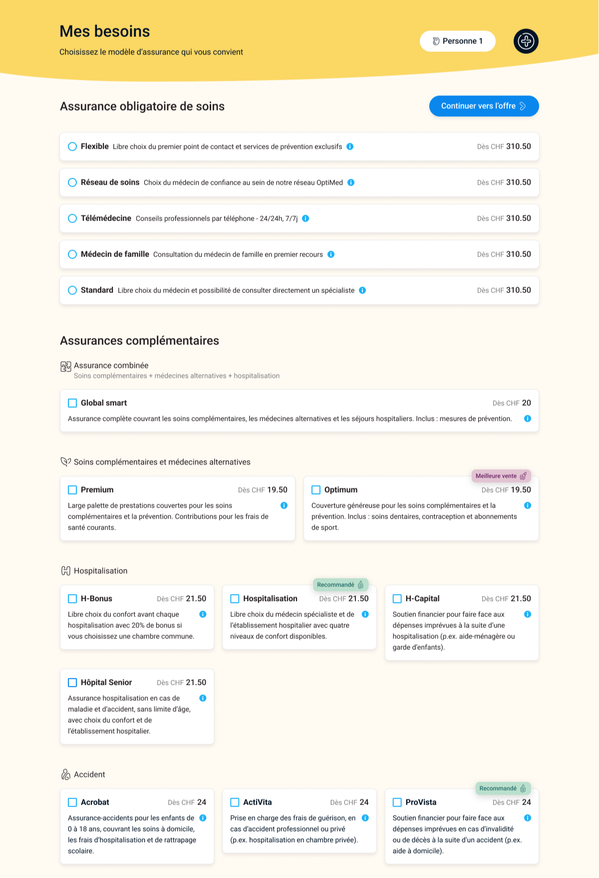
- Version B: With “Best Seller” and “Recommended” badges.
Key metrics
The key metrics we tracked were:
- Time spent on the platform.
- Number of products explored.
- Selection rates for products with and without badges.
- Post-interaction user feedback on ease of use and trust in the platform.


Left: prototype version A, without badges; Right: prototype version B, with badges.
Key Findings
The results showed a clear positive impact from the introduction of badges:
Challenges and Opportunities
While the badges clearly improved engagement and decision-making, there were notable challenges:
- Trust Issues: Although the prototype was rated favourably in terms of usability and visual appeal, some users expressed hesitation about completing a purchase due to trust concerns. This highlights the need for future iterations to focus on building user trust—especially in a sensitive domain like health insurance.
- Relevance of Recommendations: While badges helped guide users, they were only truly effective when applied to products that closely aligned with user needs. Misaligned recommendations had minimal impact on selection rates and could even cause frustration.
Recommendations for Future Iterations
- Dynamic Badge Placement: Badge relevance is key. To avoid user frustration, badges should be dynamically applied based on real-time user data or a deeper understanding of their needs.
- Building Trust through Transparency: Introducing step-by-step purchase guidance and emphasizing the platform’s reliability can increase trust. For example, providing clear information about how personal data is handled or how purchases are processed can make users feel more secure.
- Continuous User Testing: Iterative testing should be conducted to further refine the badge system and improve the overall user experience. Qualitative research, such as user interviews, can help uncover deeper insights into user trust and behaviour.
Conclusion
This project demonstrates how small yet strategic UX adjustments can significantly impact user behaviour and decision-making. The introduction of visual badges not only increased engagement but also helped guide users toward making confident, informed decisions. As UX designers, it's crucial to continuously test, iterate, and refine our designs based on real-world feedback to ensure that we are meeting user needs effectively.
Through this case study, I demonstrated my ability to lead UX projects, apply user research methodologies, and iteratively improve digital products. I look forward to leveraging these skills in future projects where I can drive user-centric innovation and business value.
Annex - Key data
Faced with complex scenarios, users take less than 2 minutes to choose 2 to 3 products.
Average time on task (in seconds)
Time decreases as participants are exposed to the interface (learning curve), but the badges ease the learning curve.
Average product selection per scenario
Badges impact positively the product selection, regardless of the scenario.
Exit by creating an offer (in %)
Badges increase the likelihood of offer creation (in order for participants to subscribe to an insurance product).


Discussion